Location: Shanghai
Design / Construction: 2017
Constrution Area: 56 sqm
Design Team: Li Han / Hu Yan / Zhang Xintong
Photography: Wang Hongyue / Lu Wenhui
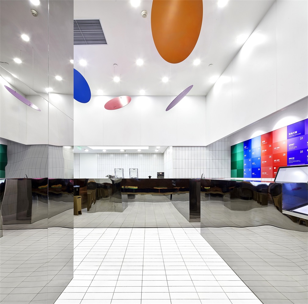
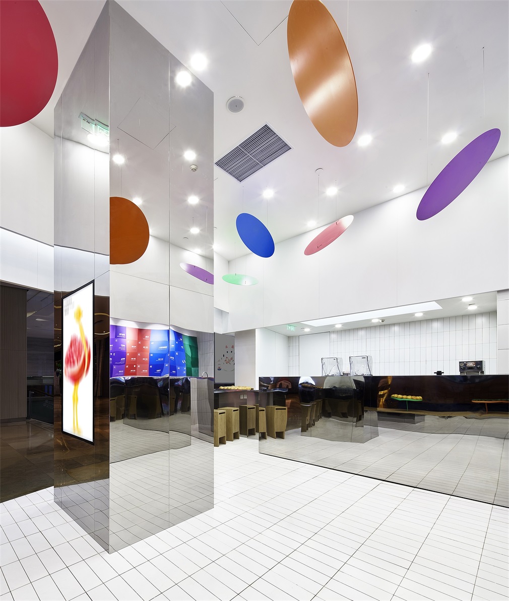
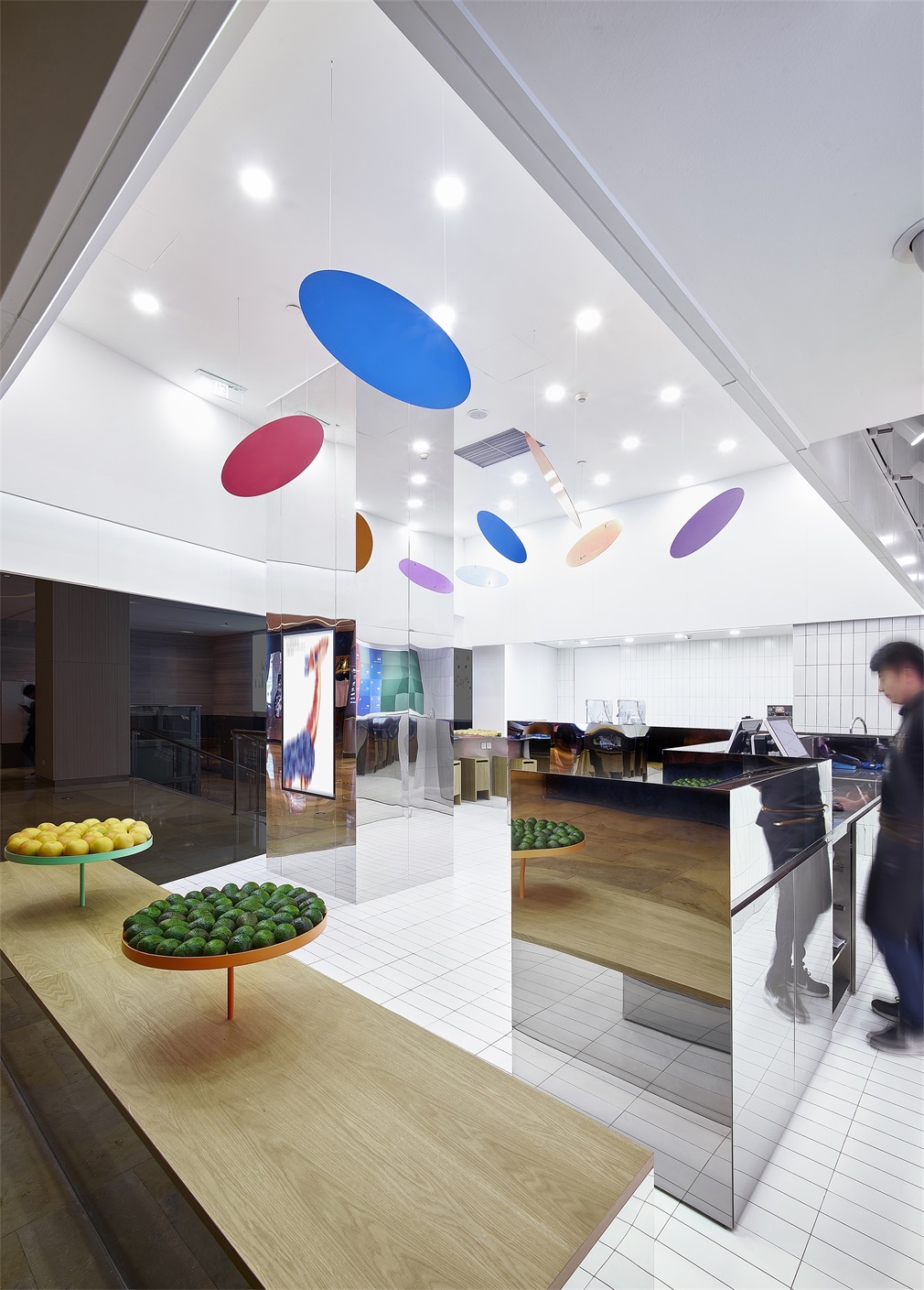
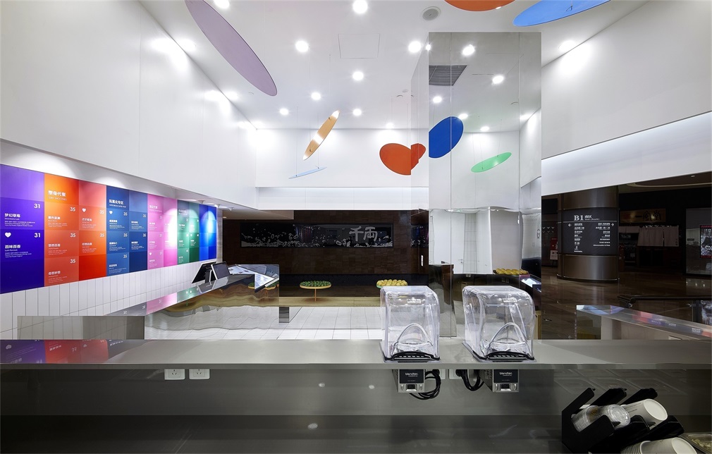
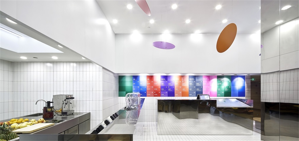
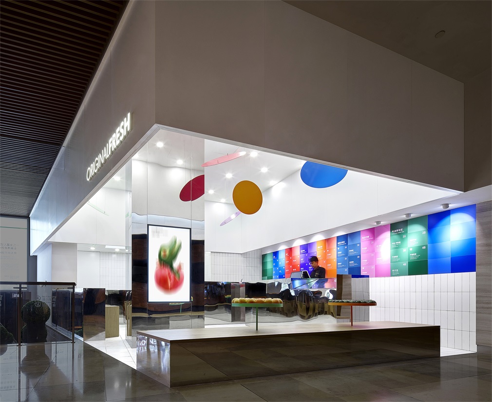
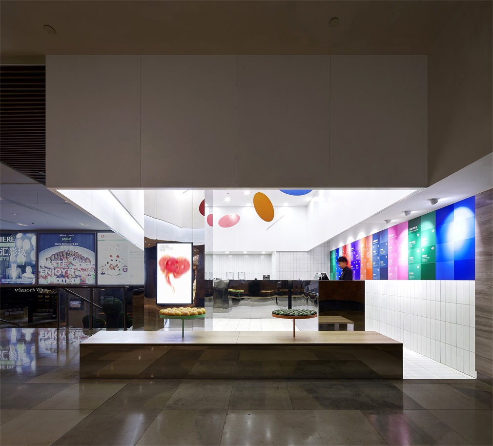
ORIGINALFRESH Jing’an Kerry Center Shanghai is the second shop Drawing Architecture Studio designed for this juice brand. ORIGINALFRESH is a prospective healthy life brand who upholds the rigorous selection of the finest fruits around the globe and the most professional juicing production. To Drawing Architecture Studio, the increasing popularity of fresh juice drinks at present complies with people’s praise for a new life philosophy underlining simplicity and health. The concept of “simplification” in such a philosophy is rather similar to that of Minimalism in art. So, in the design of ORIGINALFRESH Jing’an Kerry Center Shanghai, Drawing Architecture Studio draws inspiration from the expression of Minimalist art: the interpretation of the space is reduced to only the relationship between color and shape; the minimum colors and images are used to simplify each functional area; and everything that might disturb the subject is abandoned. The classic Minimalist art works are reinterpreted with actual functions required by the daily business of a juice shop. The overall space is like a white gallery with furniture and decorations as art works displayed within.
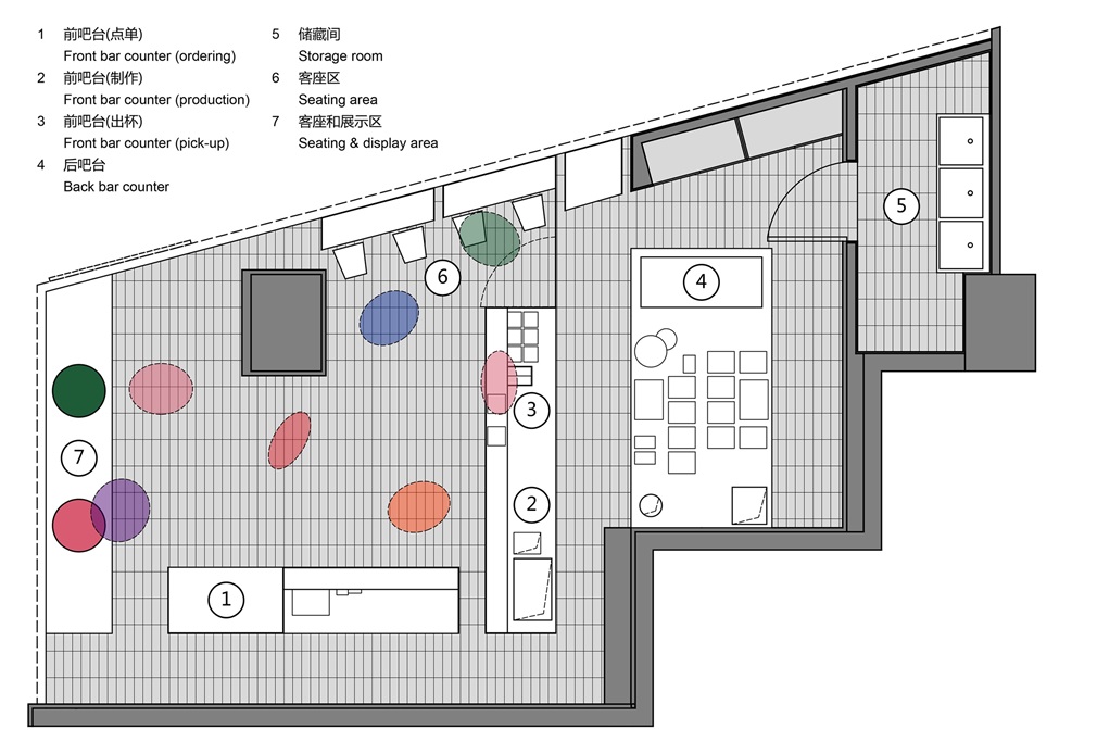
Inspired by the floating mobile sculptures by Alexander Calder, the images of fruits are abstracted from their original forms and reduced to some colorful geometric plates as a light installation hanging from the ceiling, which becomes a delightful highlight in the space. The bar counters, seating and display areas, and pillars are all transformed into stainless steel blocks of different dimensions arranged in the white space, just like the sculptures by Donald Judd. The functions of ordering, juicing, and pick-up are allocated in 2 same shaped mirror stainless steel blocks as the front bar counter. The mirror stainless steel clearly reflects the surrounding environment and movement and adds ever-changing colors and images on the surfaces of the furniture with a flowing aesthetic. It also weakens the sense of volume of the fixed furniture and pillars and makes their silhouettes rather ambiguous so that the whole space gives a certain illusionary impression. The “color charts” by Gerhard Richter are converted into a large colorful wall menu which is another eye-catcher.